Creating a component
Click Add Component in the toolbar or press N to open the Component Library.
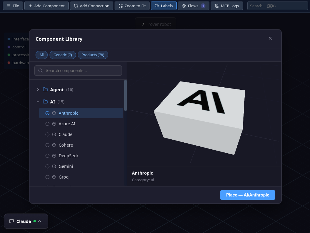
- Filter by collection — a row of toggle chips at the top lets you show or hide entire collections (e.g. Infrastructure, Generic). Multiple collections can be active at once, and your selection is remembered across sessions.
- Browse or search — categories are listed on the left. Click a category to expand it, then click a component type to select it. Use the search field to filter by name.
- Preview — the right pane shows a 3D preview of the selected component.
- Place — click the Place button at the bottom-right. The component is added to the canvas at the next available grid position.
The library organizes components into collections and categories such as Service, Storage, Network, and more. Each type comes with a distinctive 3D shape or decoration so you can identify it at a glance on the canvas.
Editing properties
Click a component on the canvas to select it. The Side Panel slides in from the right.
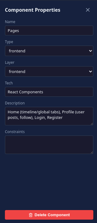
The following fields are available:
- Name — the label displayed above the component on the canvas
- Type — the component type from the library (dropdown). Changing the type also changes the 3D shape.
- Layer — which group the component belongs to (dropdown). Determines the component's color.
- Tech — technology stack as a comma-separated list (e.g. "Node.js, Express, TypeScript")
- Description — free-form notes about what this component does
- Constraints — requirements or limitations (e.g. "read-only replica", "max 1000 req/s")
All changes are applied instantly — there is no save button in the panel. Close it with the X button or by clicking empty canvas space.
Positioning
Drag and drop
Click and drag a component to move it on the canvas. When you release, it snaps to the nearest grid position. Connections follow the component automatically.
Zoom to Fit
Press Z or click Zoom to Fit in the toolbar to automatically frame all components in view.
Labels
Each component displays a label above its 3D shape with its name and type. Labels always face the camera so they remain readable from any angle.
If the canvas feels cluttered, press L or click Labels in the toolbar to toggle their visibility.
Deleting a component
Two ways to delete a component:
- Select it and press Delete
- Select it, open the Side Panel, and click the red Delete Component button at the bottom
When a component is deleted, all its connections are removed as well. If the component contains a subgraph, the nested architecture is also deleted.