The editor is organized around a central 3D canvas surrounded by contextual panels:
Menu bar
The native application menu bar contains three menus. On macOS, the standard application menu (About, Services, Hide, Quit) is also present.
File
- New (Ctrl+N) — create a new empty project. Asks for confirmation if there are unsaved changes.
- Load Demo — load the built-in "Chirp" demo architecture.
- Open… (Ctrl+O) — open a
.tesseract.jsonfile from disk. - Save (Ctrl+S) — save to the current file path (or prompt for a location on first save).
- Save As… (Ctrl+Shift+S) — save to a new file path.
- Export Mermaid… — export the architecture as a
.mermaidtext file. See Mermaid import/export. - Import Mermaid… — import a
.mermaidor.mmdfile and replace the current architecture. - Settings… — open the Settings modal.
- Quit (Ctrl+Q) — close the application. Triggers the unsaved-changes check.
MCP
- Config — shows the MCP server address (e.g.
localhost:7440/mcp) and copies it to the clipboard. Use this to configure Claude Code. - Install Skills → Globally — installs the pre-built Claude Code skills to
~/.claude/commands/so they are available in all projects. - Install Skills → For Project… — opens a folder picker and installs skills into that project's
.claude/commands/directory.
Account
- Sign In — opens the authentication modal (shown when not signed in).
- [email protected] — displays the signed-in email (not clickable).
- Sign Out… — opens a confirmation dialog, then signs you out.
- Upgrade to Pro… — opens the pricing page (visible when on the Free tier).
- Manage Subscription… — opens the Stripe billing portal (visible when on Pro).
Help
- Documentation — opens this documentation site in your browser.
- Discord Community — opens the Tesseract Discord server.
- Check for Updates… — checks for a newer version of Tesseract and refreshes your license tier.
Toolbar
The toolbar sits at the top of the window and contains all the primary actions. From left to right:

File menu
The File dropdown provides quick access to the most common file operations (New, Load, Save, Save As, Export Mermaid, Import Mermaid). See Menu bar for the full list including keyboard shortcuts.
Add Component
Opens the Component Library modal. You can also press N. See Components for details.
Add Connection
Enters connection mode. The button highlights and the status text guides you: "Select Source…" then "Select Target…". Press Esc to cancel. See Connections for details.
Zoom to Fit
Frames all components in view with the best zoom level. Shortcut: Z.
Labels
Toggles the visibility of component name and type labels on the canvas. Shortcut: L.
Flows
Opens the Flows sidebar to create, edit, and replay data flow paths. Shows a badge with the number of saved flows. See Data Flows for details.
Subgraphs
Opens the Subgraphs panel on the left side. Shortcut: S. See Subgraphs panel below.
Auto Layout
Runs a force-directed layout algorithm that repositions unpinned components to minimize overlaps and edge crossings. Pinned components stay fixed. See Layout tools for the MCP equivalent.
MCP Logs
Opens the MCP Logs drawer, which shows every tool call made through the MCP server. Each entry displays the tool name, timestamp, and expandable input/output details. Useful for debugging AI interactions.
Search
The search field (right side of the toolbar) lets you find components by name. Press Ctrl+K to focus it. Type at least 2 characters to see results. Use arrow keys to navigate and Enter to select — the canvas will navigate to the component and select it. Press Esc to clear the text and close the dropdown, or click the X button that appears inside the field.
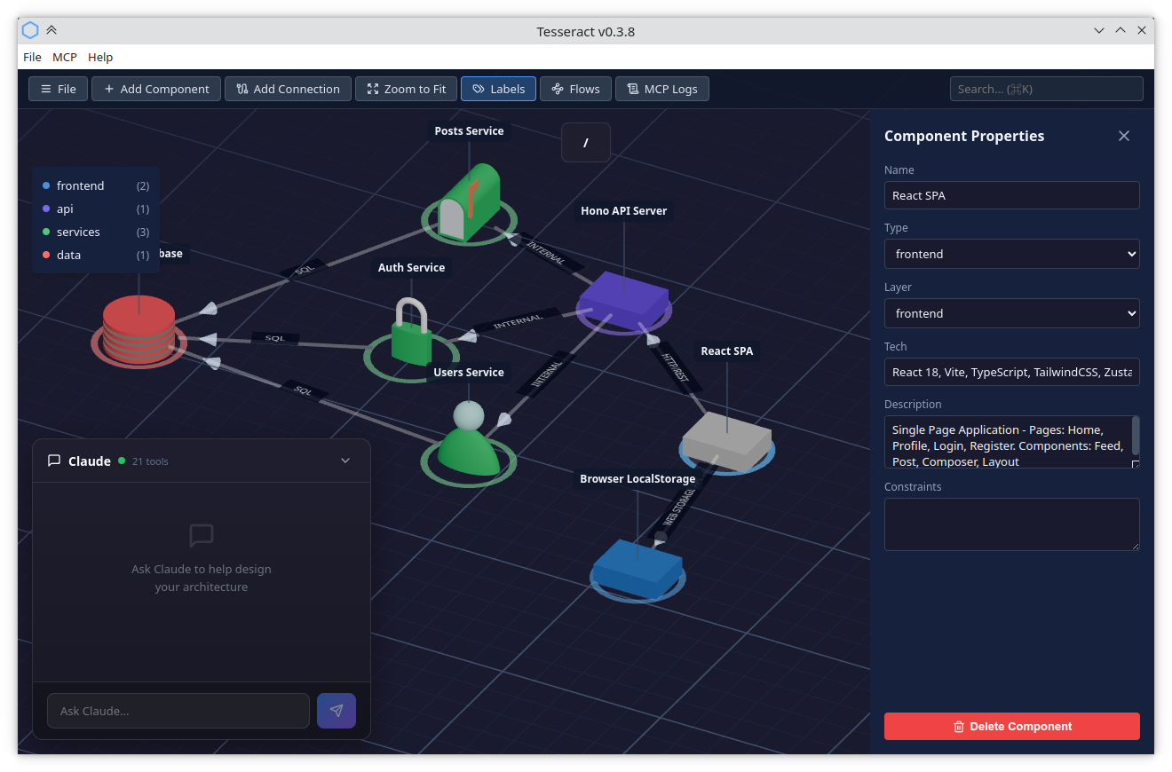
3D Canvas
The canvas is the main editing area. It displays your architecture as 3D blocks on an isometric grid.
Camera controls
- Scroll wheel — zoom in and out. The zoom is centered on the mouse cursor, so the point under your cursor stays fixed.
- Right-click + drag — rotate the view (pivots around the center of the viewport)
- Middle-click + drag — pan the view
Interacting with the canvas
- Click a component — select it and open the Side Panel
- Click a connection line — select it and show its properties
- Click empty space — deselect the current selection
- Drag a component — move it across the grid (snaps to grid on release)
- Drag a connection — bend the line to add curvature (useful when multiple connections link the same two components)
- Double-click a component — zoom into its subgraph (if it has children)
- Double-click the ground — navigate up one level
Selection
Tesseract supports single and multi-selection of components.
Single selection
Click a component to select it. The Side Panel opens with its properties. Click empty space to deselect.
Multi-selection
- Ctrl+click (Cmd+click on macOS) — toggle a component in and out of the selection
- Shift+click — add a component to the current selection
- Ctrl+A (Cmd+A) — select all components at the current level
Box selection
Click and drag on empty space to draw a selection rectangle. All components within the rectangle are selected when you release. Combine with modifier keys to refine the result:
- No modifier — replace the current selection
- Ctrl / Cmd held — toggle the enclosed components (XOR with existing selection)
- Shift held — add the enclosed components to the existing selection
Selection styles
The visual highlight applied to selected components can be changed in Settings. Three styles are available:
- Sweep (default) — a diagonal sweep band across the component with a pulsing ground disk
- Sphere — a translucent shell sphere around the component
- Reticle — four rotating triangles at ground level
Multi-select editor
When multiple components are selected, the Side Panel switches to a multi-select editor showing:
- Component list — a scrollable list of all selected components. Click the X next to a name to deselect it individually; click the name to narrow to single selection.
- Layer — dropdown that shows the common layer if all selected components share one, or lets you apply a layer to all at once.
- Type — dropdown, same behavior as Layer.
- Pin position — toggle switch. Blue means all pinned, grey means none pinned, mid-position means mixed. Clicking toggles all components.
- Delete — removes all selected components.
Breadcrumb bar
The breadcrumb bar sits below the toolbar and shows your current navigation path. If your project has a title, it appears as the root segment instead of /.
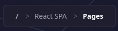
Click any segment to jump to that level. The current segment (rightmost) is displayed in bold and is not clickable. The root level is always shown as /.
You can also navigate up by pressing Esc, Backspace, or double-clicking the ground.
Side Panel
The Side Panel slides in from the right when you select a component or a connection.
Project properties
When nothing is selected and you are at the root level, the Side Panel shows the project properties: a title and a description. The title is displayed in the breadcrumb bar and used as the suggested filename when saving. Creating a new project (File → New) opens this panel automatically.
Component properties
- Name — text input
- Type — dropdown populated from the component library
- Layer — dropdown listing available layers
- Tech — comma-separated tags (e.g. "Node.js, Express")
- Description — resizable text area
- Constraints — resizable text area
- Pin position — toggle switch that freezes the component in place during Auto Layout
- Delete Component — red button at the bottom
Connection properties
- From / To — read-only component names
- Swap Direction — button to reverse source and target
- Bidirectional — checkbox
- Protocol — text input (e.g. "HTTP", "gRPC")
- Description — text area
- Delete Connection — red button at the bottom
All changes are applied in real time — there is no save button in the panel. Close it with the X button or by clicking empty canvas space.
Layer Legend
A small overlay in the top-left corner of the canvas lists all layers with their color dot and name. Each entry also shows the number of components in that layer.
In read-only mode, the legend serves as a quick visual reference. Double-click the legend to open the Layer Editor (Pro feature):
- Rename — click a layer name to edit it inline. All components using that layer are updated automatically.
- Recolor — click the color dot to open a palette of preset colors.
- Reorder — drag layers up or down using the handle on the left.
- Add — click "+ Add layer" at the bottom to create a new layer with an auto-assigned color.
- Delete — click the trash icon. Components on a deleted layer are reassigned to the first remaining layer.
Click Done or anywhere outside the legend to exit edit mode.
Subgraphs panel
Click Subgraphs in the toolbar (or press S) to open a sliding panel on the left side showing a tree view of every component that contains a subgraph.
The tree starts with the project root and indents nested subgraphs. The current level is highlighted in blue. Click any entry to navigate there instantly (with the standard elevator animation). You can also use the keyboard:
- ↑ / ↓ — move focus through the tree
- Enter — navigate to the focused subgraph
A badge next to the title shows the total number of subgraphs in your project. Close the panel with the X button or by pressing S again.
Undo & Redo
All graph mutations (adding, removing, or editing components, connections, and layers) can be undone and redone.
- Ctrl+Z (Cmd+Z) — undo the last change
- Ctrl+Shift+Z (Cmd+Shift+Z) — redo
- Ctrl+Y (Cmd+Y) — redo (Windows convention)
Text edits in the Side Panel (name, tech, description, etc.) are coalesced into a single undo entry per field: focusing a field starts a group, and blurring it closes the group. This means undoing a name change reverts the entire typed value in one step, not character by character.
Batch operations from the multi-select editor (changing the layer or type of multiple components) are also recorded as a single undo entry.
The history holds up to 50 entries. Making a new change after undoing discards the redo stack.
Claude Console
In the bottom-left corner, a collapsible console lets you chat directly with Claude. Click the header to expand it.
- Send messages — type in the input field and press Enter (Shift+Enter for newline)
- Streaming responses — Claude's answers appear incrementally as they are generated. A stop button replaces the send button during generation, letting you interrupt mid-response while keeping partial output.
- Resize — drag the top edge, right edge, or top-right corner to resize the console. Click the maximize button (next to the collapse chevron) to expand it to full size; click again to restore. Dimensions are remembered across sessions.
- Status indicator — a green dot means connected and authenticated, grey means not authenticated
Claude can read and modify your architecture through the MCP integration. The console shows tool usage status while Claude works on your architecture.
The built-in console does not have access to your source code. It is designed for architecture brainstorming — discussing component design, exploring trade-offs, and refining your system structure. For code generation or code analysis, use Claude Code directly in your terminal.
Settings
Open from File → Settings in the menu bar. All preferences are saved to your browser's local storage and persist across sessions and projects.
Claude Console
Toggle the visibility of the Claude Console in the bottom-left corner of the editor.
Background
Pick a ground plane color theme. Four options are available:
- Default — dark slate
- Black — midnight
- Light — light grey
- Printable — white (useful for screenshots destined for documents)
Selection style
Choose the visual highlight for selected components: Sweep, Sphere, or Reticle. See Selection styles for a description of each.
Depth rings
Toggle the concentric rings displayed below components that contain subgraphs. When enabled, a set of descending rings indicates that a component can be double-clicked to navigate into.
Mouse mode
Switch between two mouse control schemes:
- Default — right-click to rotate, middle-click to pan
- CAD — right-click to pan, middle-click to rotate (matches the convention in many CAD applications)
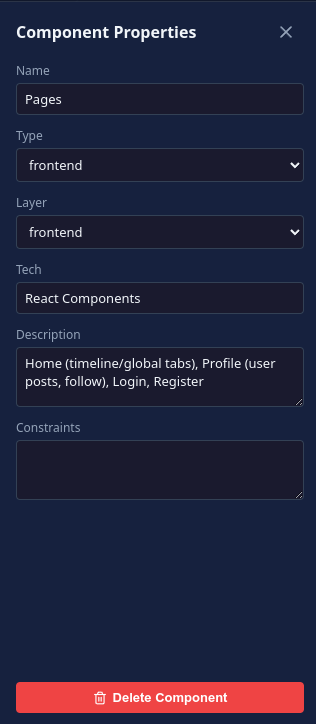
Component Library modal
Triggered by the Add Component button or the N key. The modal is split into two panes:
- Filter chips — a row of toggle chips at the top lets you filter by collection. Click a chip to show or hide that collection's components. Multiple collections can be active at once. Your selection is remembered across sessions.
- Left pane — a searchable tree of categories and component types. Click a category to expand it, then click a component to select it.
- Right pane — a 3D preview of the selected component
Click Place to add the component to the canvas. It is automatically positioned at the next available grid slot.
Some categories are only available on higher subscription tiers (Pro, Enterprise).