Opening the library
Click the Add Component button in the toolbar to open the library modal. It appears as an overlay on top of the editor.
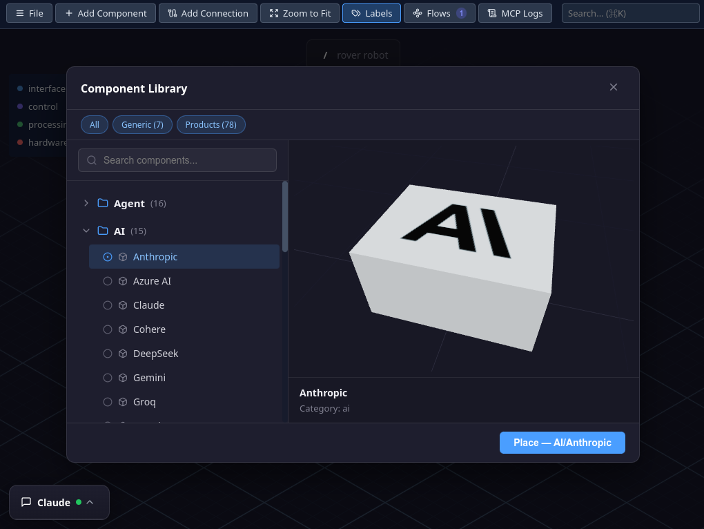
Browsing components
The modal is split into two panes:
- Left pane — a tree of categories and components. Click a category to expand or collapse it. Each category shows a badge with the number of components it contains.
- Right pane — a live 3D preview of the selected component. The model auto-rotates slowly and you can orbit around it with the mouse.
Components are organized by collection and category. A component type is identified by its Category/Name path (e.g. Database/Redis, API/API Server). This is the identifier used in the side panel and in MCP tools.
Searching
Use the search field at the top of the left pane to filter components by name. The search matches both category names and component names. Matching categories auto-expand so you can see the results immediately.
Clear the search with the X button to return to the full tree.
3D preview
When you select a component, a live 3D rendering appears in the right pane. The model rotates automatically so you can see it from all angles. You can also interact with the preview:
- Right-click drag to orbit around the model
- Middle-click drag to pan
- Scroll wheel to zoom in or out
These are the same mouse controls used on the main editor canvas. The preview shows the component's name and category at the bottom of the pane.
Placing a component
Browse or search the library and click the component you want.
The Place button at the bottom of the modal becomes active. It shows the component type (e.g. "Place — Database/Redis"). Click it to add the component to the canvas.
The component is placed on the canvas with an auto-assigned position. You can then drag it to the desired location and edit its properties in the side panel.
Layer coloring
Each 3D model in the library has designated color zones. When a component is placed on the canvas, those zones take on the color of its layer. This makes it easy to identify which layer a component belongs to at a glance, regardless of its type.
If you change a component's layer (via the side panel) or change a layer's color (via the Layer Editor), the 3D model updates its color automatically.
Pro collections
The library is organized into collections, each tied to a subscription tier. Free-tier users have access to a core set of components. Pro collections add more specialized types (infrastructure, advanced databases, cloud services, etc.).
Components from Pro collections are not visible in the library modal for Free-tier users. If you open a project that uses Pro component types, they appear as default boxes on the canvas instead of their actual 3D models.
list_types MCP tool returns only the component types available for your current tier. Claude will only use types you have access to.